Inspiration
Inspiration from Nature
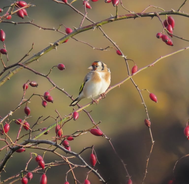
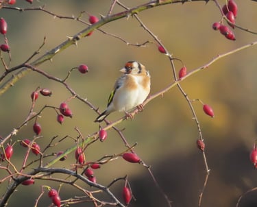
Just by looking at the picture on the right one can right away realize that mother nature is the greatest implementer of color harmonization. On the right you can find a beautiful blend of colors, enough to give a much needed warmth this autumn season. A goldfinch bird lies calmly on a tree branch majestically colored with a warm array of colors. The surrounding berries help into making this creature stand out.
This photo was an inspiration for choosing some of the colors on our catalogue. These colors were an instant success. These colors are:
Cheesecake OR-17
Warm Vanilla OR-62
Sandalwood Incense OR-72
November Afternoon OR-48
Black OR-99
Choose to color your space with this color palette and you will be instantly gratified with a warmth straight from nature itself.
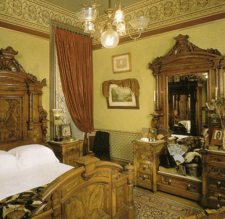
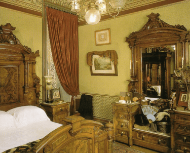
High style Victorian interiors were often a florid display of color and pattern. The papered walls and ceiling of this bedroom have a strong and cohesive, olive and burgundy (complementary colors) tonality which unifies the room and its furnishings
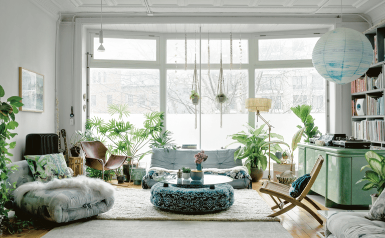
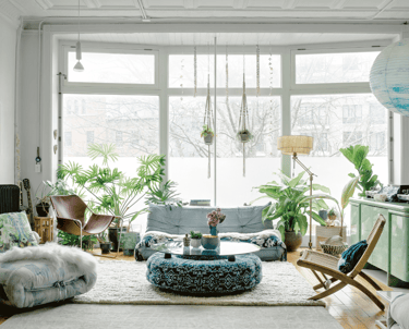
The many plants act as neutrals to tone down the mint color of the credenza. The colors in this living room are gradients of green and blue for a calm and relaxing atmosphere. The soft and desaturated orange within the books on the shelf is used to gently 'pop' in the room
An elegant and soft mix of warm, cool, natural, and neutral colors to give this area a calm yet passionate feel
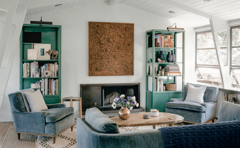
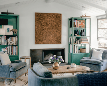
This living room reads primarily neutral, however two emerald green bookshelves give it energy. The upholstery fabrics on the sofa and chairs pick up on this hue with a subtle green tint.
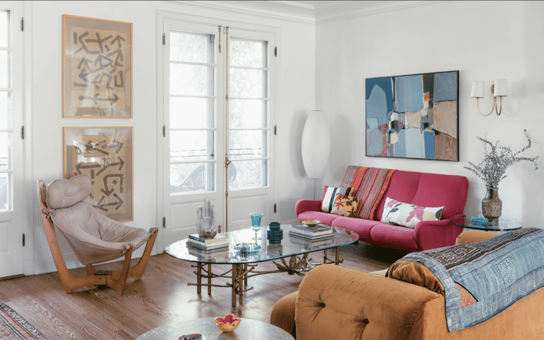
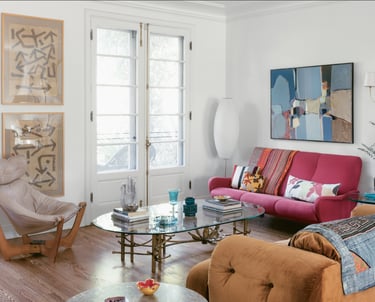
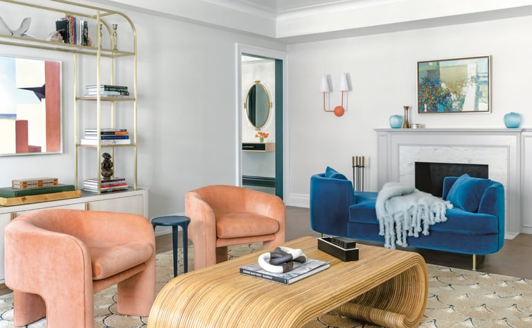
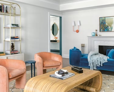
This room is mostly warm colors, as in the pink love seat and orange yellow sofa. Blues are used to tone down the warmth of the warmer colors, giving the room a sense of calm. All these colors are on a backdrop of neutral off-white walls and natural wood flooring.
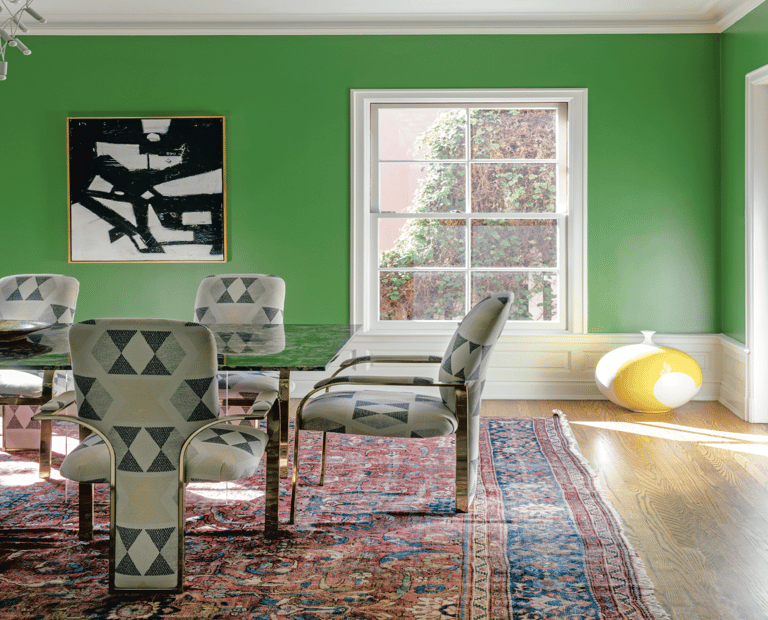
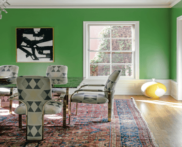
This dining space is a wonderful example of a bolder use of a cool color making the room feel alive without being overwhelming. The happy green is balanced out by the oriental rug in deep reds and blues, grounding the entire space. When you use bolder colors, it is important to find ways to make it feel unified.

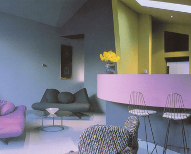
This discordant color scheme is reminiscent of hi-style interiors from the 1960's. At first glance the colors are in conflict and do not go along. However with a mind that thinks outside the box and a little courage the effect is wonderfully stylized and theatrical.
Questions? Do not hesitate to reach out!
Phone
hello@orepaints.com
+961 3 01 04 91
© 2022. All rights reserved.
+961 5 80 50 04
Mobile/Whatsapp