Color & Psychology
It is widely recognized that color has strong psychological significance and can even, to some degree, influence physical reactions in humans.
What do cool colors represent?
Water, sky, snow, grass
Feelings evoked
Calm, soothing, refreshed
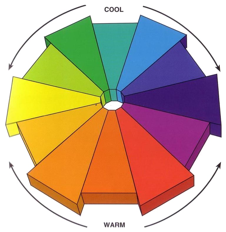
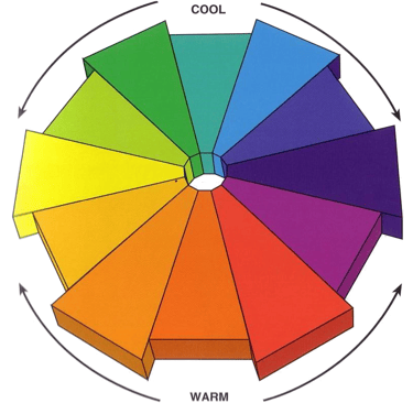
Cool colors
Blue, Purple, Green, and anything in between
Spatial Effect
Make small rooms appear larger
What do warm colors represent?
Warm colors
Orange, yellow, red, and anything inbred
Sunlight, heat

Feelings evoked
Coziness, passion, playfulness
Spatial Effect
Make larger rooms appear cozier
Warm colors are generally associated with the impact of the use of the word warm. We speak of a warm greeting, a warm friendship, and a warm atmosphere. These colors are considered comfortable, cozy, homelike, and pleasant. Experiments have shown that interiors with primarily warm schemes will prove comfortable with air temperatures lower than required to achieve similar comfort in identical spaces using cooler colors.
Impact of specific hues
RED As the color of fire and blood red has primary implication of excitement, heat, intensity, and force. In a sense it is the strongest of colors. The association with fire leads to an association with DANGER and WARNINGS against DANGER. When reduced to a tint red becomes pink and loses some of its psychological intensity. Pink is commonly associated with femininity, gentle warmth, with charm and delicacy. When reduced to a shade, red becomes a warm brown.
ORANGE This color is a secondary, resulting from the mixture of red and yellow, and shares properties with both of them. The intensity of excitement implied by red is somewhat reduced but still present. The sense of cheer associated with yellow emerges so that orange because a color with happy commercial implications. It is tinted into beige, largely pleasant and comfortable, and shaded into brown
YELLOW This is the warm color with the least problematic implications. It is less aggressive in impact than red and is generally seen as having a happy implication, probably because its most saturated form is still considered to be light. Yellow seems open and expansive, the color of sunlight and the more attractive artificial lighting. Yellow has a strong place in interior design as the color of cheer, activity, and mild stimulation. Its tints (creams, beige and light tan are popular background colors, warm but never overbearing. Shades of yellow become tans, lighter browns, darker browns, that are all useful colors that retain some of the sense of lightness that characterizes the pure hue.
GREEN This is the secondary falling between yellow and blue and it is the warmest of the cool colors. Its content of yellow gives it some of the pleasant characteristics associated with yellow, while its blue content make it seem more calm. At its best, greens seems to combines the cheerfulness of yellow with a greater sense of stability. There has been a tendency to regard green as an ideal color, offering some of the virtues of all the other colors. Green has associations with the natural colors of grass, trees, and other vegetation and so it is thought as the most natural color, calming and restful to the eyes. Associations of health and well being connect to green. It is the color of GO signal, opposite to the danger implication of red. All of these qualities, in somewhat reduced intensity, survive in tints of green, while shades move down to increasing levels of dignity and solidity.
BLUE This is the coolest of the cool colors, having no content of warmer tones. It has associations with calm that can border on depression (feeling blue, getting the blues, playing the blues), but also with simplicity, purity, truth, and dignity. Blue is said to encourage thought, contemplation, and meditation, and so it is the color of intellectual activity. Bright blue can lower body temperature, pulse rate, and blood pressure, and thus it stands as a complete opposite to red and its effects. It is the color of the sky and the ocean, and hence it suggests openness and spaciousness. Blue is often associated with officialdom and authority. Tints of blue share the qualities of bright blue with reduced degree. Shades of blue, as they move towards black, become increasingly heavy and dignified.
VIOLET Violet and purple are often thought about as problematic. Violet, as it falls between red and blue on the color circle, incorporates the conflicting values of warmth and coolness, of liveliness and calm. In the spectrum, it does not stand between two neighbors (as the other secondaries, orange and green, do), but it falls, rather, at the end farthest away from red. This reality may contribute to its reputation as a color of tension and ambiguity. In many contexts, it is suggested that violet and purple are best avoided altogether as they are tricky to work with, and because they are considered disturbing to many people. However, and at the same time, violet is often viewed as the color of subtlety, sensitivity, and artistic expression. Pale tints of violet and lavender are thought of as being light, playful, and magical. Deeper violets and purples are dignified, mystical, and royal. Use of violets and purples must be approached with extreme caution.
BROWN Browns are the deeper shades of red, orange, and yellow, however these shades seem sufficiently different from the chromatic colors to deserve their own name. All browns are warm colors and have implications related to their parent tone. They tend to appear warm and comforting, but have an unfortunate relationship to thoughts of dirt and soil. The more positive implications relate to the comforts of the farm, of simple homes, and the basic honesty of wood, undyed textiles, and materials such as bricks, tiles, and stones. Browns lack the energetic implications of red, orange, and yellow but retain some of their qualities of warmth and comfort. When used in combination with other warm tones, browns are favorite colors for expression of a combination of of dignity and subdued comfort. There is always a concern that browns may become depressive if not used with other colors that hold a more chromatic and lively implication.
WHITE The lack of chromaticism in white makes it pure, and therefore symbolic of purity, cleanliness, simplicity, and clarity. On the other hand, it can also suggest emptiness, blankness, and boredom. White is a highly effective foil to chromatic colors and can be quite successful as an empty surround to more aggressive tones. The implications of white as a norm for the expression of sanitation is well known. The term 'white' is used for a variety of tints of all the chromatic colors- we can have cool whites or warm whites. The extensive use of white in design of the modern movement has made it something of a symbol of modernism.
BLACK This is the color opposite to white, reflecting, in perfect example, no light whatsoever. Black is a strong color with powerful implications of strength, seriousness, dignity, and formality. Too much black and one risks a sense of emptiness or blankness. In extreme cases black has associations to negative nature relating to depression, fear, and death. Black and white together form an extreme contrast of nonchromatic colors that can be powerful and sharp, but can also be stern and forbidding. The elegant combination of black, white, and primary chromatic tones was a key aspect of the expressive program of early modernism and continues to be a forceful and suggestive of the basics of the modern movement in design. Blacks can be warm or cool through the addition of some small component of chromatic color, making them, in a strict sense, no longer pure black. Dark grays and very dark blues can be so close to black as to be scarcely distinguishable, and therefore such tones share the expressive qualities of black.
GRAY Colors that result from the mixture of black and white or from the mixtures of complementaries are neutrals that can range from light to dark and from totally neutral tones to warmer or cooler colors. In the lighter ranges, grays do not project strong associative implications. In darker tones, they share the characteristics of black to a degree in both of the positive and negative implications. Dark gray can be authoritative or ominous. Lighter grays, particularly in warm toned versions, are useful background colors, bland by themselves, but serving as effective foils for more chromatic color tones.
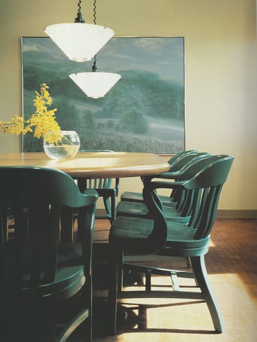
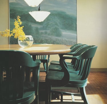
The cool colors of green and blue offer a sense of calm and order in this conference room of the American National Bank
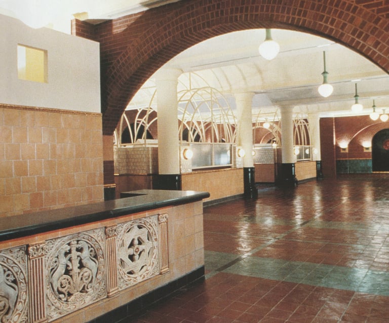
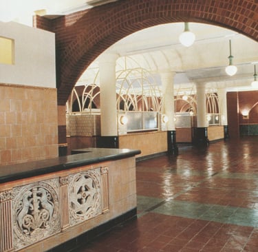
Generally neutral colors dominate the lobby of The Archive, a New York apartment building converted from a federal post office
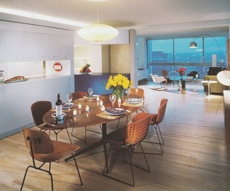
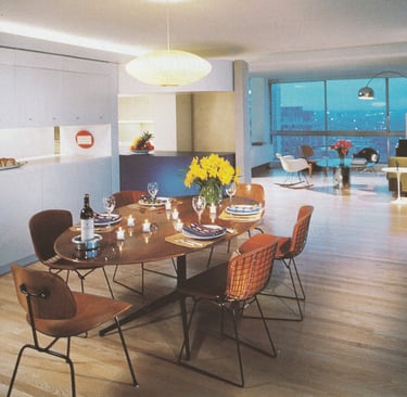
Warm, cool, and neutral tones are all present in the living and dining area of a Chicago apartment
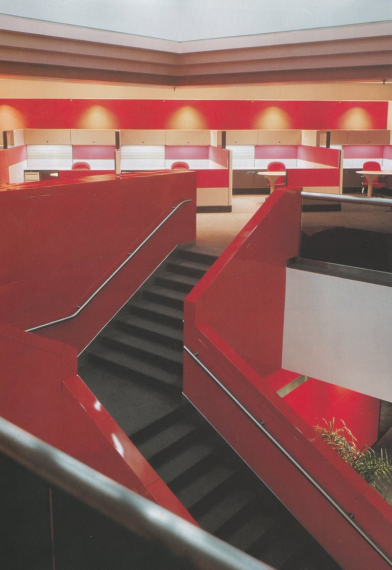
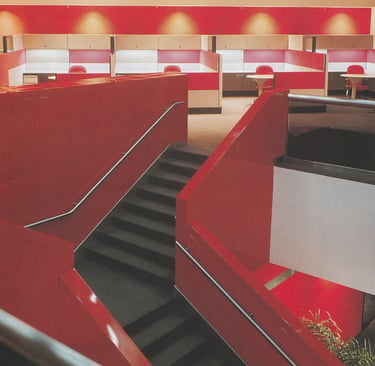
Red and hues close to red dominate the interior of this office complex at the General Motors Saturn plant
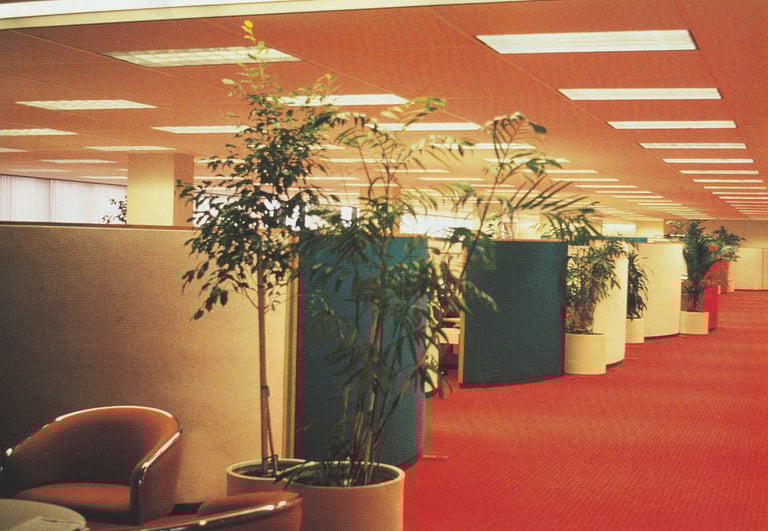
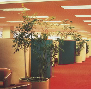
A strongly warm color tonality is established by the use of orange carpeting in these offices. The orange tone is also reflected onto the white ceiling
Cool colors are associated with calm, relaxation, and a more contemplative experience. These colors tend to lower the sense of actual air temperature and so are often preferred in situations where excessive heat can be anticipated. At an extreme, cool colors may become depressive and negative in psychological impact.


Questions? Do not hesitate to reach out!
Phone
hello@orepaints.com
+961 3 01 04 91
© 2022. All rights reserved.
+961 5 80 50 04
Mobile/Whatsapp